mHealth Possibilities in a Changing World. Distribution of Global Cell Phone Subscriptions
Andrew Bastawrous1,2, Benjamin Hennig3,Iain Livingstone4
1MRC Clinical Research Fellow in International Eye Health, International Centre for Eye Health, London2Kenyan Ministry of Health, Division of Ophthalmology, Nairobi 3Research Associate, University of Sheffield, Sheffield,4Ophthalmology Registrar, NHS Greater Glasgow & Clyde, Glasgow
Corresponding Author: Andrew.bastawrous@ishtm.ac.uk
Journal MTM 2:1:22-25 2013
DOI:10.7309/jmtm.2.1.4
A global shift in predominance of mobile/cell phone ownership in the last decade has seen low-income countries reach near ubiquitous levels. Using 11 years of compiled census data from each country worldwide we mapped the global picture of cell phone ownership and used density-equalizing cartograms to depict this change.
Introduction
Estimates of wealth distribution reveal that the richest 2 per cent of adult individuals own more than half of all global wealth, with the richest 1 per cent alone accounting for 40 per cent of global assets. In contrast, the bottom half of the population together hold approximately 1 per cent of global wealth. Members of the top decile are almost 400 times richer, on average, than the bottom 50 per cent, and members of the top percentile (the 99th percentile) are almost 2000 times richer. (1)
The association of wealth inequality and poor population health has been well described. (2) The ability of healthcare professionals to impact this in a positive way is limited and has traditionally been the role of those in government or positions of political and economical influence.
The world has however experienced a technological revolution that has allowed boundaries defined by wealth to be crossed. Currently, more people have access to a mobile phone worldwide than clean running water. Although this is an alarming fact, it also indicates the value individuals place on communication.
The use of mobile and wireless technologies to support the achievement of health objectives
(mHealth) is changing the way patients are accessing healthcare worldwide.
Mobile cellular network coverage is growing to the point of ubiquity and mobile devices are advancing continually in to more sophisticated hand held computers.
There are reportedly over 5 billion wireless subscribers; over 70% of them reside in low- and middle- income countries (3) and over 85% of the world’s population has wireless signal cover. (4)
The, “Inverse Care Law” describes the availability of good medical care varying inversely with the need for it in the population served (5) and has been described in detail elsewhere. (6)
A trend which is showing a reversal of the inverse care law is that of mobile phone ownership.
Statistical analysis can be used to interpret and give meaning to data, however, the ability to interpret large quantities of data and it’s resulting statistical reporting is not always straightforward. Graphical representations such as graphs and maps are a way of translating or converting data in to a visual interpretation. (6) We aimed to create global cartographic representations of the shifting landscape of mobile phone ownership.
Research Methodology
We have developed 12 cartograms to depict the distribution of mobile phone subscribers worldwide. Data for the years 2000 through to 2011 were available from the Census.gov site. We applied the Gastner & Newman diffusion-based method (7) to create density-equalised maps, also known as cartograms. The software used for these maps is the Cartogram Geoprocessing Tool, a script that integrates into the ArcGIS 10 application by ESRI. In the maps, each of the reference areas (countries) are resized according to the published data.
Larger areas represent higher numbers and smaller areas proportionally smaller data values. The principle behind this map transformation follows the basic concept of a pie chart in a geographic form, where each country represents one slice of the chart. The data that is used for the cartograms therefore is an absolute number of the mobile phone subscribers in a country in that year. In the map output the cartogram algorithm turns these absolute values into a representation of the shares between the countries. The representation always relates to all users worldwide in that year. The absolute global rise of subscribers between the individual years therefore is not reflected in these maps, rather than the change in shares between countries on a global scale over time.
We present results for the years 2000, 2006 and 2011. The country colour scheme was adapted from the Worldmapper Project, which allows an easier orientation in the map by distinct country colours and similar colour hues for the major world regions.(8, 9) The major regions are coloured in a rainbow scheme following the relative status of a region according to the Human Development Index.
Results
These results depict the global distribution of cell phone ownership with countries and regions transformed according to the prevalence of ownership in a given location, i.e. where relative ownership is high that area (e.g. the USA) is distorted to have greater land mass then a region of relatively lower ownership, e,g. Africa. The maps do not depict absolute levels of ownership and thus should be interpreted with this in mind. The overall ownership of cell phones has increased in each region of the world in the last decade, however this has been more so in some regions. This relative shift in ownership can be appreciated by comparing mapped data from Figures 1 through to 3 and the animation. High-income regions have grown in mobile phone subscriptions over the study period, however this increase has been less than the increase experienced in low- and middle-income regions and therefore the cartographic representations show a relative decrease in the size the Americas, Europe and Australasia.
Discussion
We believe these maps can be used to share data in a visual, intuitive and comprehensible way, which will be understood by policy makers and can be used by advocates for global health.
These maps show changing proportions worldwide as the total usage over time increases, the trend is towards an increased distribution of mobile phone subscriptions in resource-poor countries whilst demand is now almost saturated in the wealthy part of the world.
The earliest available mobile phones were only available to the wealthy. The rapid expansion of mobile phone operators and handset providers coupled with improved technology at increasingly affordable prices has meant that basic handsets are available to the majority. In the last five years near ubiquity has been reached in adult populations in high-income regions.
Mobile phone technology has narrowed the gap between high and middle/low-income countries like no preceding technological advance. Low-income countries in which no fixed-line technology was available have leapfrogged straight to mobile communication.
Health systems in low- and middle-income countries face many challenges to deliver affordable, high-quality healthcare. Barriers include lack of infrastructure and access to information. As a result health care providers, program managers, donors and policy-makers have been looking for innovative ways to overcome the mounting challenges. It is believed mHealth holds such promise.(10)
The evolution of mobile phone technology has introduced new possibilities to the field of medicine. Combining technological advances with medical expertise has led to the use of mobile phones in all healthcare areas including diagnostics, telemedicine and research.
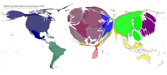
Figure 1. Density equalising cartogram of mobile-cellular phone subscriptions in the year 2000
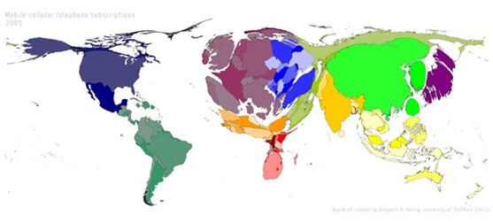
Figure 2. Density equalising cartogram of mobile-cellular phone subscriptions in the year 2006
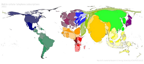
Figure 3. Density equalising cartogram of mobile-cellular phone subscriptions in the year 2011. All 12 maps from 2000 to 2011 are viewable in animation form at the following URL:http://wrld.at/cellphone
With the unprecedented increase to mobile phone access in low- and middle-income countries, the future of health care, particularly in resource-poor settings is being changed by our ability to communicate.
References
1. Davies J, A S, S S, E W. The World Distribution of Household Wealth. Mapping Global Inequalities. 2007.
2. Nowatzki NR. Wealth inequality and health: a political economy perspective. Int J Health Serv. 2012;42(3):403-24. Epub 2012/09/22.
3. Union IT. [03/11/2012]; Available from: http://www.itu.int/ITU-D/ict/statistics/
4. World_Health_Organization. mHealth. New horizons for health through mobile technologies. Global Observatory for eHealth Services.3:1-112.
5. Hart JT. The inverse care law. Lancet. 1971;1(7696):405-12. Epub 1971/02/27.
6. Bastawrous A, Hennig BD. The global inverse care law: a distorted map of blindness. The British journal of ophthalmology. 2012. Epub 2012/06/29.
7. Gastner MT, Newman ME. From The Cover: Diffusion-based method for producing density-equalizing maps. Proceedings of the National Academy of Sciences of the United States of America. 2004;101(20):7499-504. Epub 2004/05/12.
8. Dorling D. Worldmapper: the human anatomy of a small planet. PLoS Med. 2007;4(1):e1. Epub 2007/04/07.
9. Dorling D, Barford A, Newman M. WORLDMAPPER: the world as you’ve never seen it before. IEEE Trans Vis Comput Graph. 2006;12(5):757-64. Epub 2006/11/04.
10. Trevor Lewis CS, Gina Lagomarsino, Julian Schweitzer. E-health in low- and middle-income countries: findings from the Center for Health Market Innovations. Bull World Health Organ. 2012(90):332-40. ![]()

0 Comments
Trackbacks/Pingbacks